数据动态可视化,python-plotly.express使用基础
利用plotly快速实现数据的动态可视化,生成一定顺序的动画:
px是一个高级api,除了可视化为scatter,还可以由DataFrame数据直接生成 'bar', 'bar_polar', 'box', 'choropleth_mapbox', 'density_contour', 'density_heatmap', 'density_mapbox', 'histogram', 'line', 'line_3d', 'line_geo', 'line_mapbox', 'line_polar', 'pie', 'scatter_3d', 'scatter_geo', 'scatter_mapbox', 'scatter_matrix', 'scatter_polar', 'scatter_ternary', 'treemap', 'violin'。
## 安装plotlypip install plotly ## 或者 conda install plotly
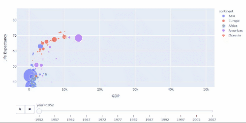
import plotly.express as pxgapminder = px.data.gapminder() # 导入需要使用的数据集gapminder.head()
country | continent | year | lifeExp | pop | gdpPercap | iso_alpha | iso_num | |
|---|---|---|---|---|---|---|---|---|
0 | Afghanistan | Asia | 1952 | 28.801 | 8425333 | 779.445314 | AFG | 4 |
1 | Afghanistan | Asia | 1957 | 30.332 | 9240934 | 820.853030 | AFG | 4 |
2 | Afghanistan | Asia | 1962 | 31.997 | 10267083 | 853.100710 | AFG | 4 |
3 | Afghanistan | Asia | 1967 | 34.020 | 11537966 | 836.197138 | AFG | 4 |
4 | Afghanistan | Asia | 1972 | 36.088 | 13079460 | 739.981106 | AFG | 4 |
## 动态绘图px.scatter(gapminder, x='gdpPercap', y='lifeExp',color='continent', size='pop', size_max=60,animation_frame='year', animation_group='country',range_y = [30,100], range_x = [-5000,55000],labels = {'gdpPercap':'GDP', 'lifeExp':'Life Expectancy'})## 参数中,首先给定一个DataFrame,指定x,y所在列,animation_frame指定关于哪个维度变化,labels为一个dict,可自定义显示的坐标轴名称。